Overview
Client
Innovation and Digital Development Agency
Services
UX/UI audit & Dashboard design
Project date
05.2024 – 07.2024
Redesigned dashboard to access government services
Objective
The MyGov dashboard redesign focused on transforming a legacy government SaaS platform into a centralized, task-based interface used by millions of Azerbaijani citizens. The goal was to reduce friction in accessing public services, unify fragmented experiences across government APIs, and ensure WCAG 2.1 compliance. Strategically, the redesign aimed to shift user behavior—encouraging digital self-service over in-person visits—by prioritizing accessibility, modular navigation, and trust-driven interaction patterns.
Challenge
The legacy dashboard suffered from structural overload, fragmented flows, and low discoverability. Services were buried in bureaucratic card stacks with unclear labels, causing high bounce rates and abandonment in critical flows. The platform also had to serve a highly diverse user base—from tech-savvy citizens to first-time users with varying levels of digital literacy and accessibility needs—making consistency and clarity critical. Using product analytics, event-based tracking, and support ticket classification, I surfaced recurring drop-off points tied to identity verification, document retrieval, and appointment scheduling, indicating a pattern of task confusion and cognitive fatigue..
Approach
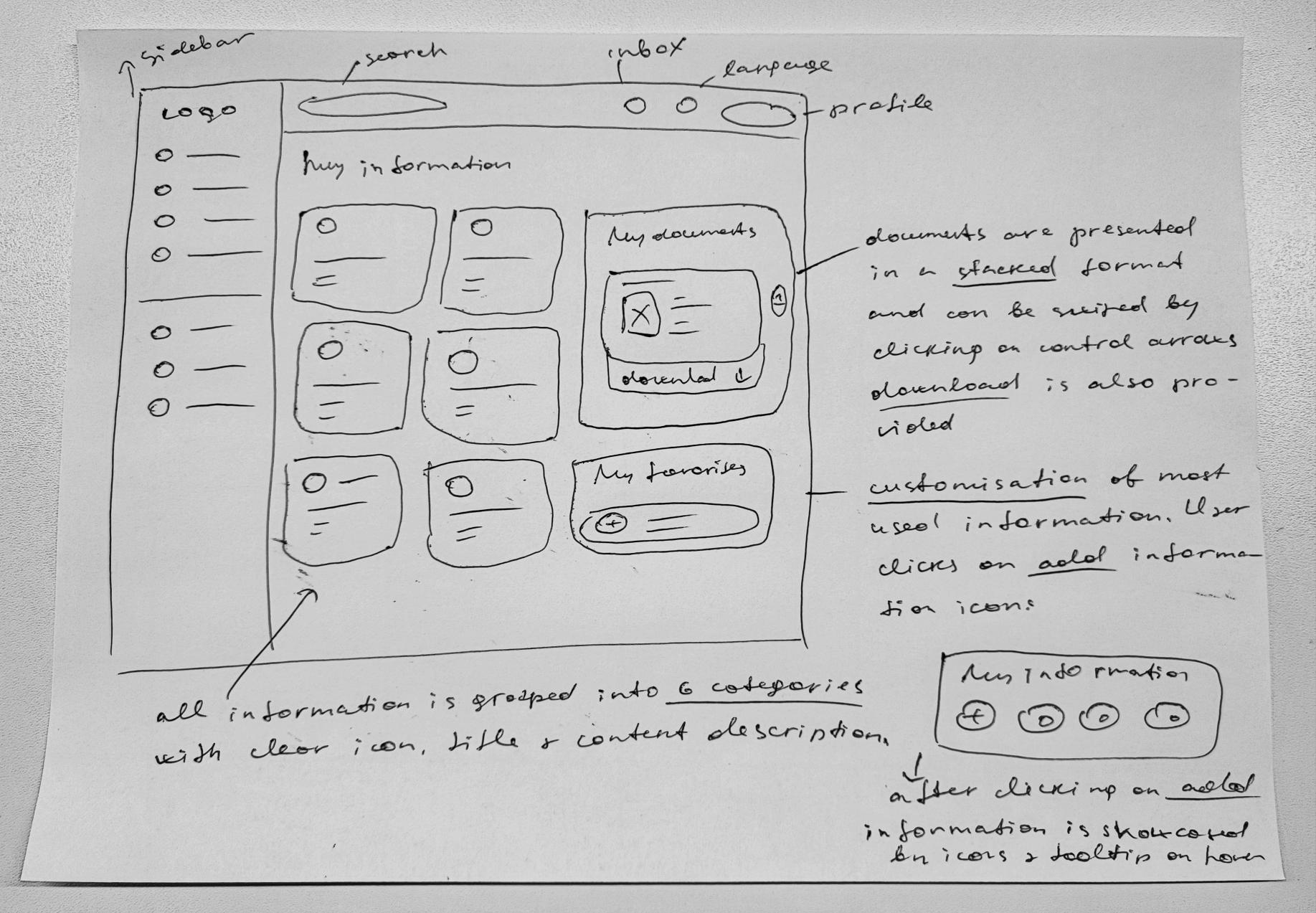
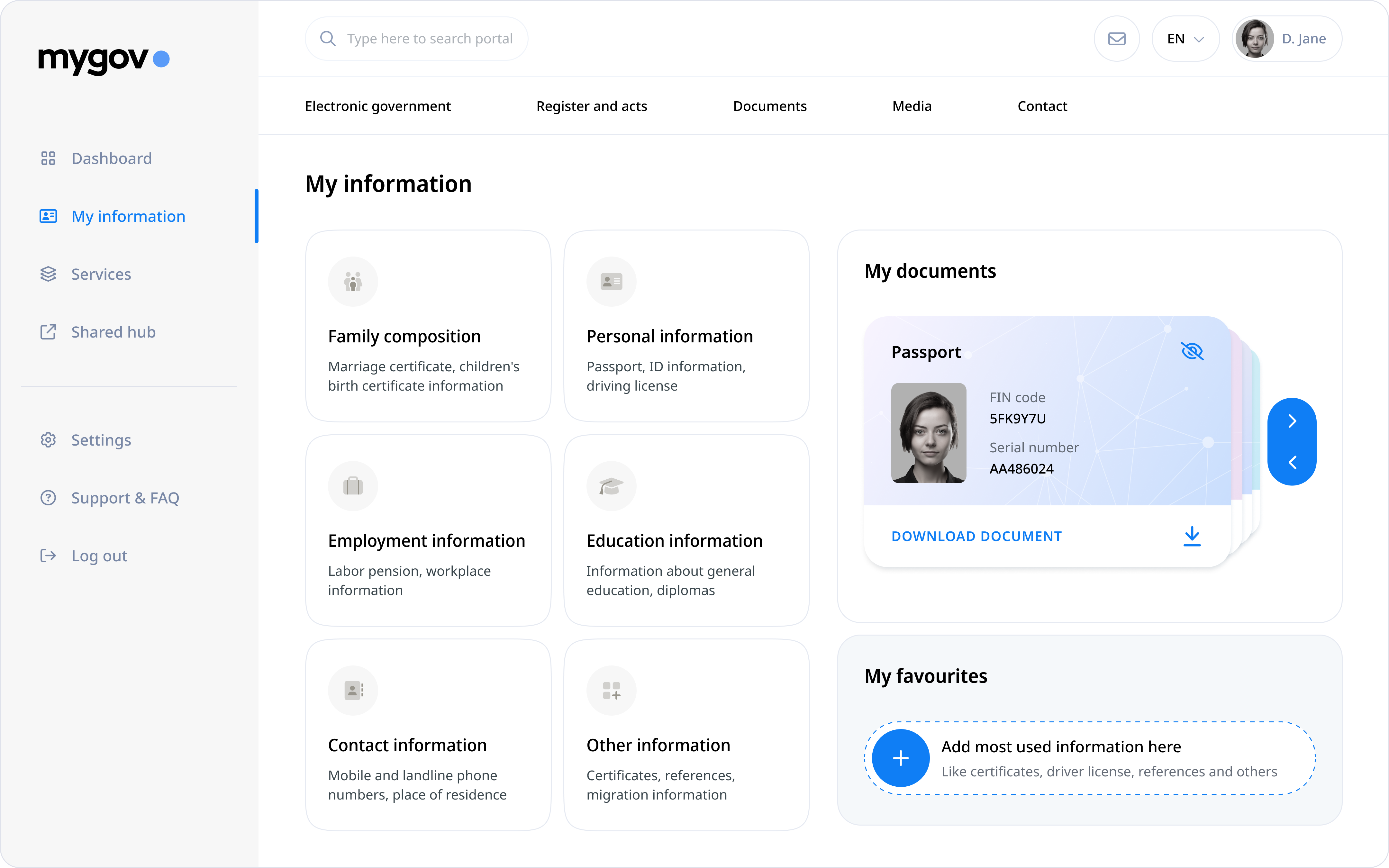
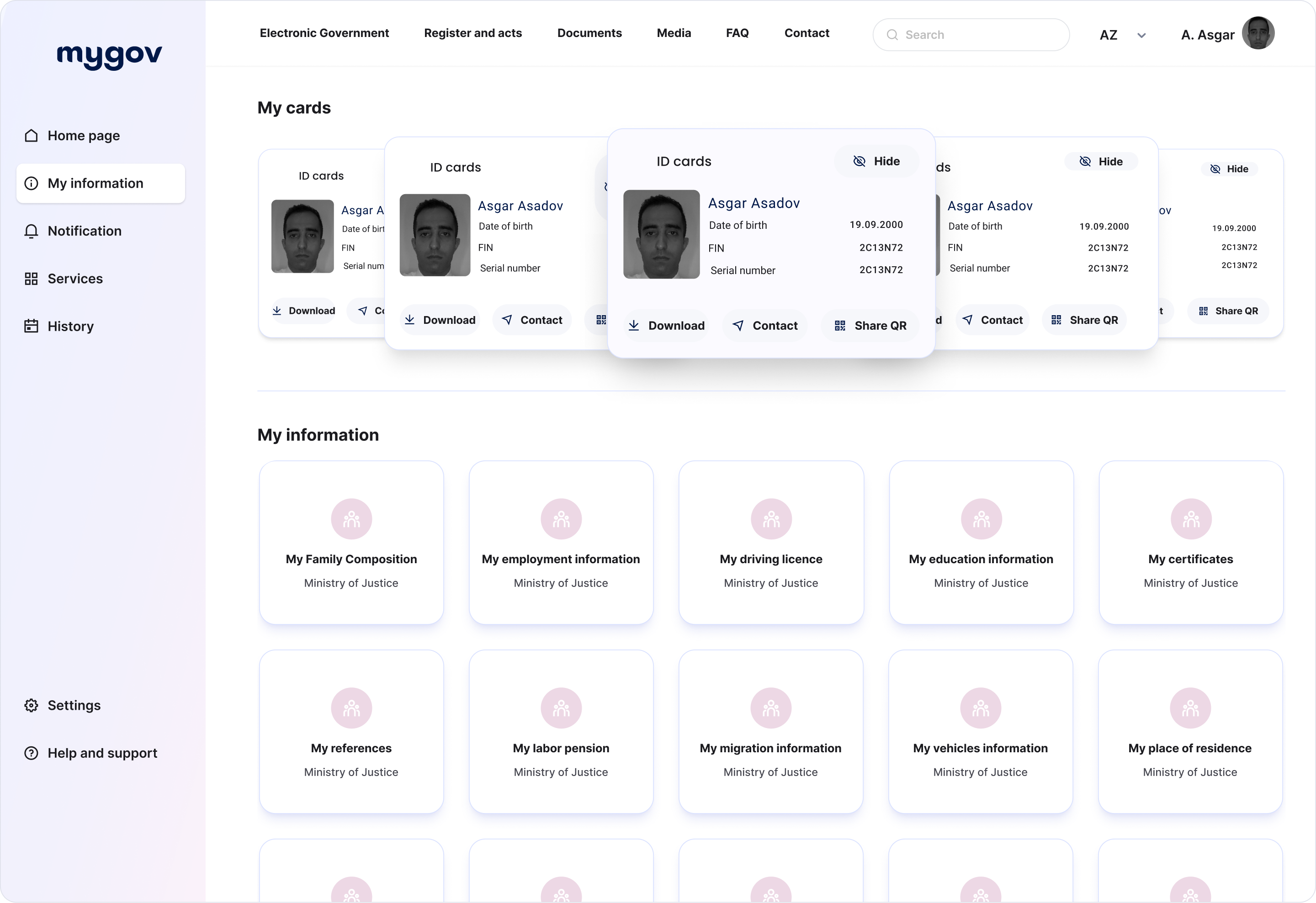
To address these challenges, I conducted a full-spectrum UX audit using heuristic evaluation, user interviews, and event-based interaction heatmaps. I restructured the information architecture into clearly defined sections—“My Documents,” “My Information”, “My Services,” and “My Favourites”—using label–icon–description pairings to reduce ambiguity and cognitive load. I introduced a modular layout with lazy-loaded content blocks and personalized dashboard controls to allow users to pin high-priority services. These changes were validated through A/B testing, task-based usability studies, and accessibility audits. The redesign led to a 30% reduction in support tickets, a 45% reduction in early-stage drop-offs in tasks, more than 90% task completion in service flows and measurable increases in service discovery, and user confidence.
Interface Comparison: Legacy vs Redesigned Dashboards
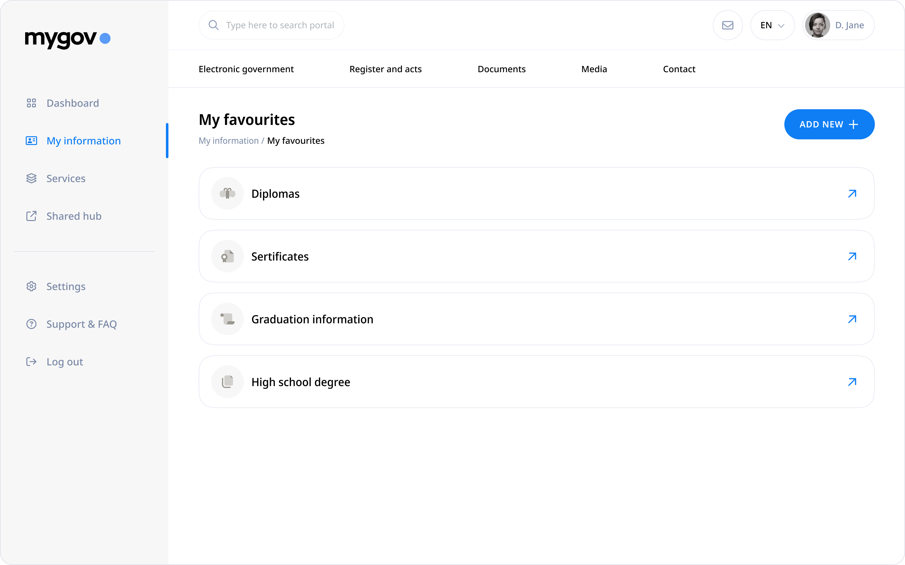
Information Architecture
/ Old version: The legacy structure relied on dense card stacking and long-scroll layouts, presenting 38 disconnected Data Access Points at once. This caused cognitive overload and poor scannability. Tree testing and user journey mapping revealed high confusion locating essential services, with task failure rates over 38%.
/ New version: I restructured the dashboard using taxonomy validation, consolidating the 38 Data Access Points into semantically grouped categories under My Information — resulting in 6 unified Information Access Modules. Each featured consistent text–icon–description layers. This improved navigation clarity and reduced time-to-task by 29%, as measured in pre/post usability benchmarking.
Visual Hierarchy & clarity
/ Old version: Usability testing and eye-tracking heatmaps exposed scanning friction due to visual clutter, misaligned grids, and the absence of semantic grouping. Users reported high effort in locating key services.
/ New version: I applied a visual hierarchy model, organizing information into six digestible categories, reinforced with contrast-tested icons and succinct microcopy. As a result, task recognition time dropped by 41%, confirmed through quantitative scan-path analysis.
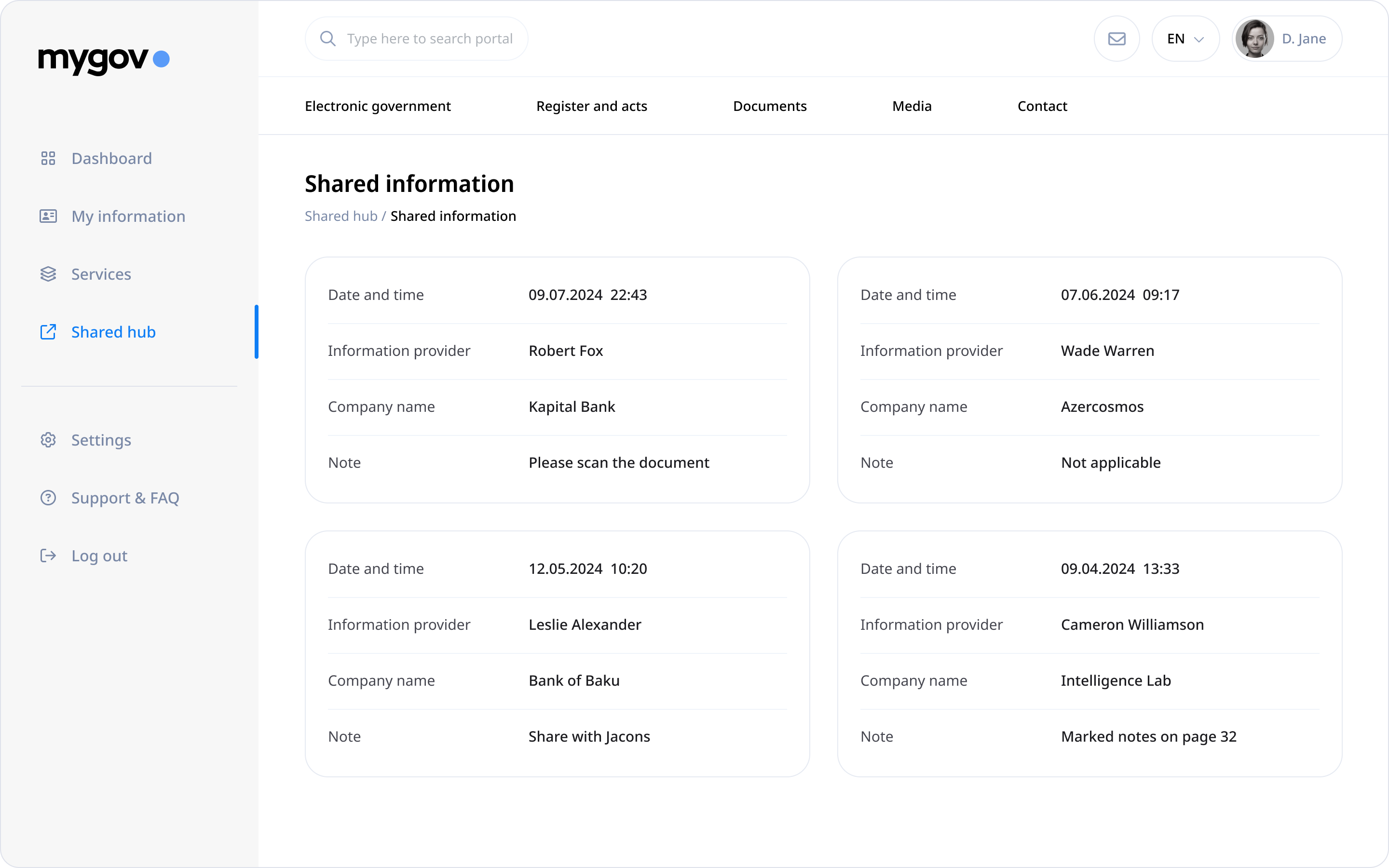
Access patterns & compliance
/ Old version: Overlapping card formats hindered discoverability of essential documents. Support ticket logs consistently flagged poor access to ID records, and accessibility audits revealed non-compliance with WCAG 2.1 structure and heading levels.
/ New version: I introduced a lazy-loaded, persistent “My Documents” module with API-linked retrieval and direct anchor access. Optimized tab order and semantic labels improved assistive tech compatibility. This resulted in a 30% decrease in document access-related support requests within the first 90 days post-launch.
UX Audit Findings & Strategic Design Improvements
Customization and Personalization
/ Old version: The dashboard offered no mechanism for prioritizing content, resulting in a flat, one-size-fits-all experience. User segmentation analysis revealed mismatches between task frequency and information layout, especially for returning users.
/ New version: I introduced a customization “My Favourites” module using persistent state-saving and frequency-based pinning logic, aligning with Jakob Nielsen’s 10 Usability Heuristics for flexibility and efficiency of use. Clickstream analytics showed a 22% reduction in navigational steps across repeat user sessions.
Visual aesthetics
/ Old version: Accessibility scans flagged non-compliant contrast ratios and inadequate font scaling, contributing to low readability and perceived unreliability. Voice-of-customer surveys confirmed user frustration with visual overload.
/ New version: I applied a modern visual system using WCAG-compliant contrast, rem units for scalable typography, and a grid-aligned layout with functional whitespace. In A/B testing, this led to an 18% increase in visual satisfaction scores and improved task flow completion among visually impaired users.
Interactive Elements
/ Old version: The absence of interaction affordances like hover states, pressed feedback, and motion cues led to missed actions and form abandonments—confirmed by session replay tools and click dropout analytics.
/ New version: I implemented a consistent motion design system for buttons, links, and cards using microinteractions and status-based animation layers. Usability testing confirmed a 23% increase in interaction accuracy, and session replays showed reduced hesitation time on critical CTA surfaces.
Usability Testing Insights: Marriage Registration Flow
KEY ISSUES
/ Ineffective CTA Visibility: During moderated usability sessions with 22 participants representing multiple user personas (first-time, returning, mobile-limited), over 48% failed to identify the “Apply Now” button due to insufficient contrast, non-standard placement, and lack of visual feedback.
/ Cognitive Friction in Health Verification: Task-based flow mapping and user flow diagram mapping revealed that 82% of users encountered confusion at the health check stage. Users lacked contextual guidance and perceived the step as offline-only due to inconsistent phrasing and absence of progressive disclosure.
/ Insufficient Onboarding Transparency: In unmoderated testing, 71% of users hesitated to begin the flow due to unclear cost and document expectations. Many assumed an offline visit would still be required. This distrust stemmed from the absence of a structured overview at entry point.
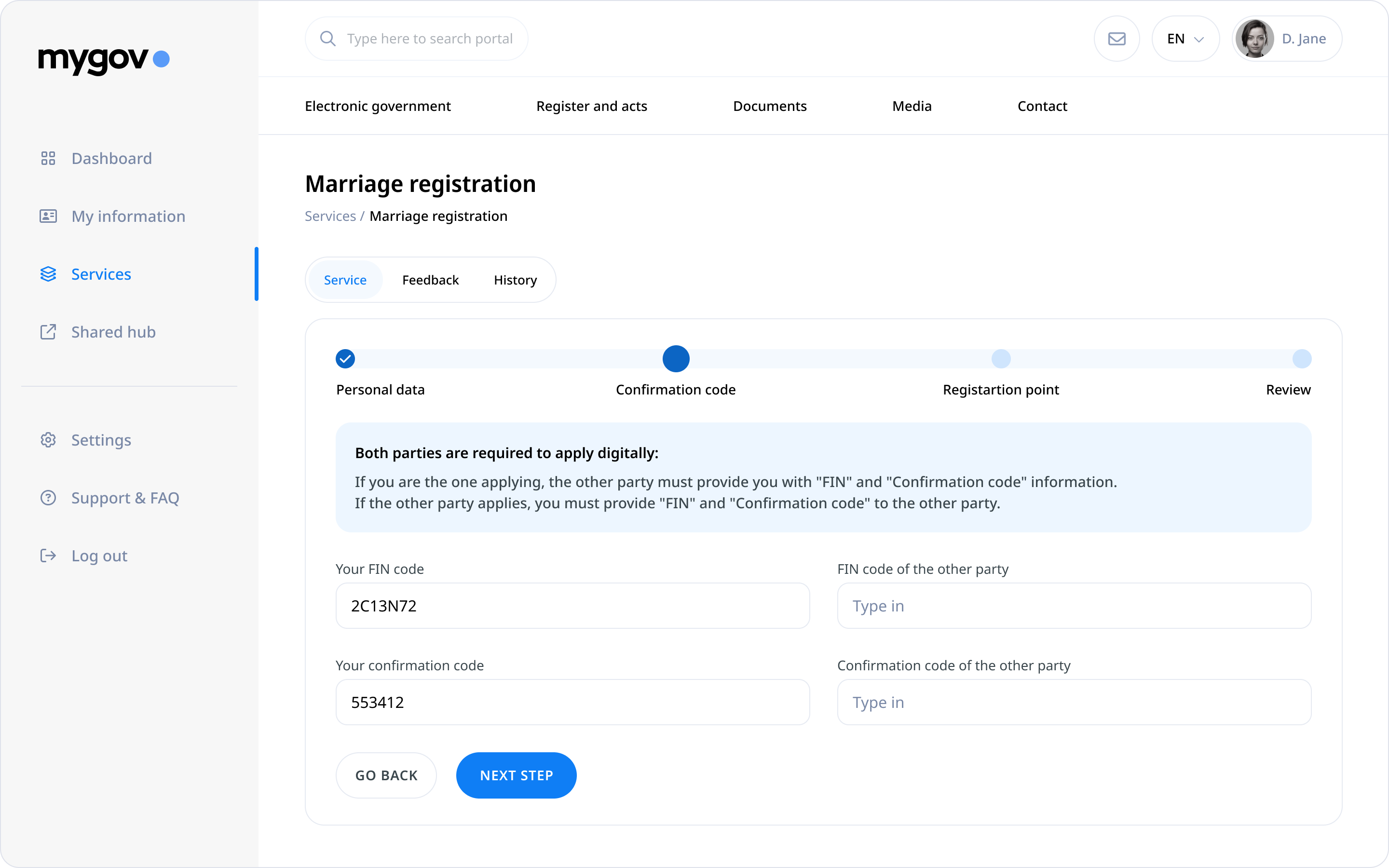
/ Input Overload at Entry Stage: Users encountering the initial registration screen were presented with multiple simultaneous input fields without preview of flow length. Cognitive walkthroughs revealed increased mental load, with 64% reporting anxiety about missing required information or not knowing how long the process would take.
Usability Solutions highlitghs: Marriage Registration Flow
Design solutions
/ Enhanced CTA Placement & Contrast: I repositioned the “Apply Now” CTA using Fitts’s Law for target predictability and applied WCAG 2.1-compliant contrast, reinforced with hover/active states and iconography. Placement was shifted to the completion area of the form, validated through first-click testing, resulting in 67% faster CTA discovery.
/ Contextualized Health-Check Process: I introduced a collapsible guidance module with inline step-by-step breakdown, updated language modeled after plain language UX standards, and embedded deep links to FAQs. This reduced drop-off at that step by 52%, confirmed through funnel analytic.
/ Structured Onboarding Screen: To mitigate confusion, I implemented a step-zero onboarding layer that transparently listed service steps, cost breakdown, and document requirements. Content architecture was based on progressive disclosure principles and informed by user interviews with citizens who previously abandoned the flow.
/ Progressive Step-Based Input Chunking: The long-form input stage was restructured using multi-step progressive disclosure, spreading entry fields across four sequential stages. Each step introduced a horizontal progress tracker and in-context hints. This approach reduced perceived effort and supported user autonomy, aligning with Jakob Nielsen’s 10 Usability Heuristics for user control and freedom.
Usability Testing outcomes: Marriage Registration Flow
Success metrics
/ Flow Completion Rate: In post-implementation A/B testing (n=28), the redesigned flow achieved 100% completion, with no reported confusion or assistance required.
/ Task Clarity & Speed: 93% of users completed the entire journey without interruption, and the average time to task completion dropped by 38%, benchmarked against the legacy version.
/ Net Promoter Score: NPS reached 72, with qualitative feedback highlighting improved transparency, ease of navigation, and reassurance from contextual guidance.
/ Engagement with Onboarding Layer: 78% of users engaged fully with the onboarding screen, as confirmed by scroll-depth analytics, and 86% cited upfront transparency as a factor that increased their trust in the digital process.
/ Drop-Off Reduction in Early Stages: Form abandonment between Step 1 and Step 2 dropped by 45%, and hover tracking showed users spent less idle time assessing what to do next—suggesting clearer task expectations and improved cognitive alignment..