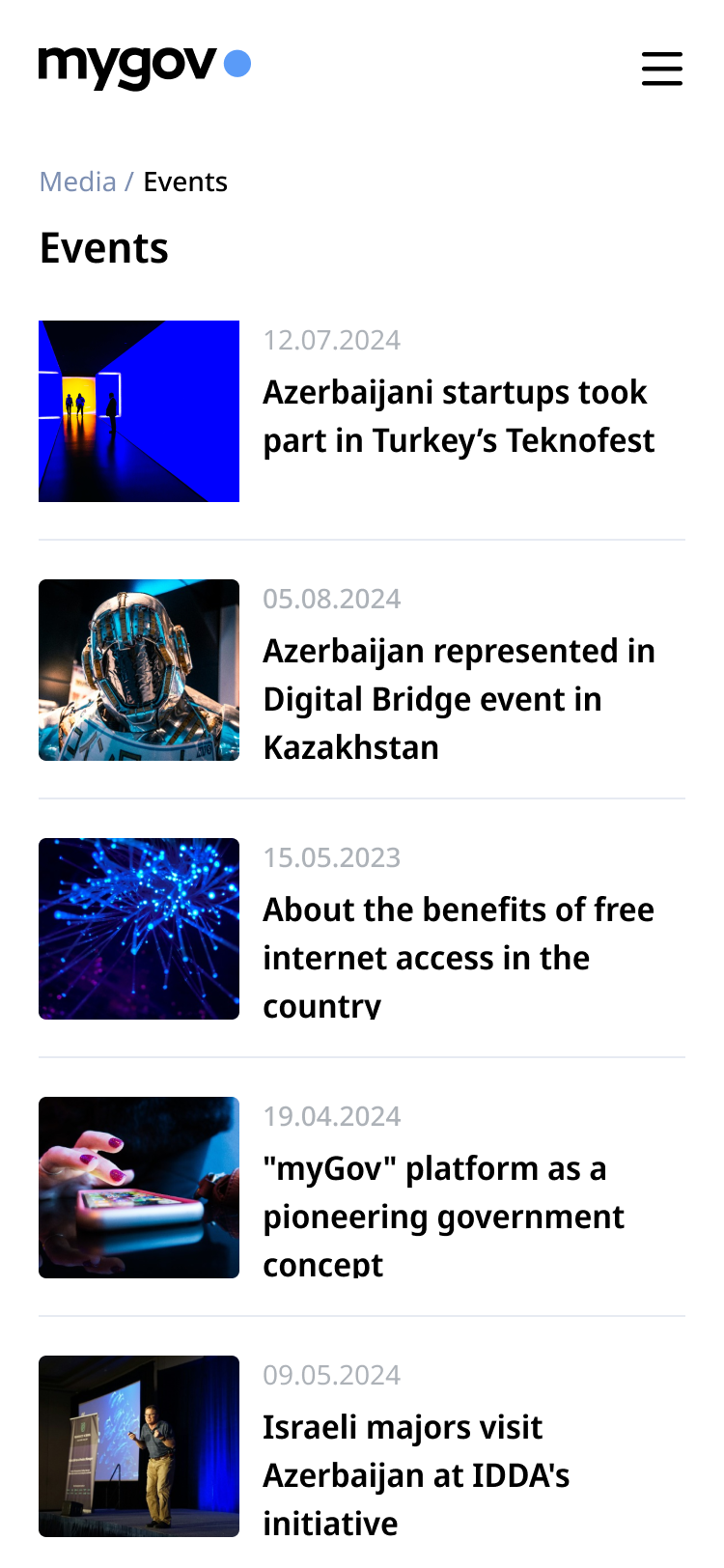
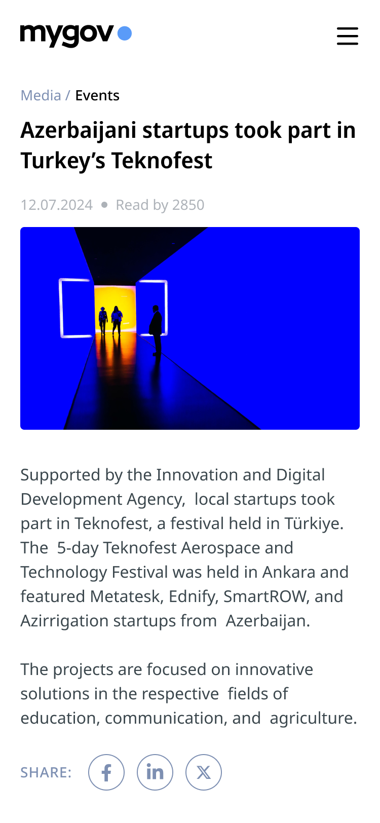
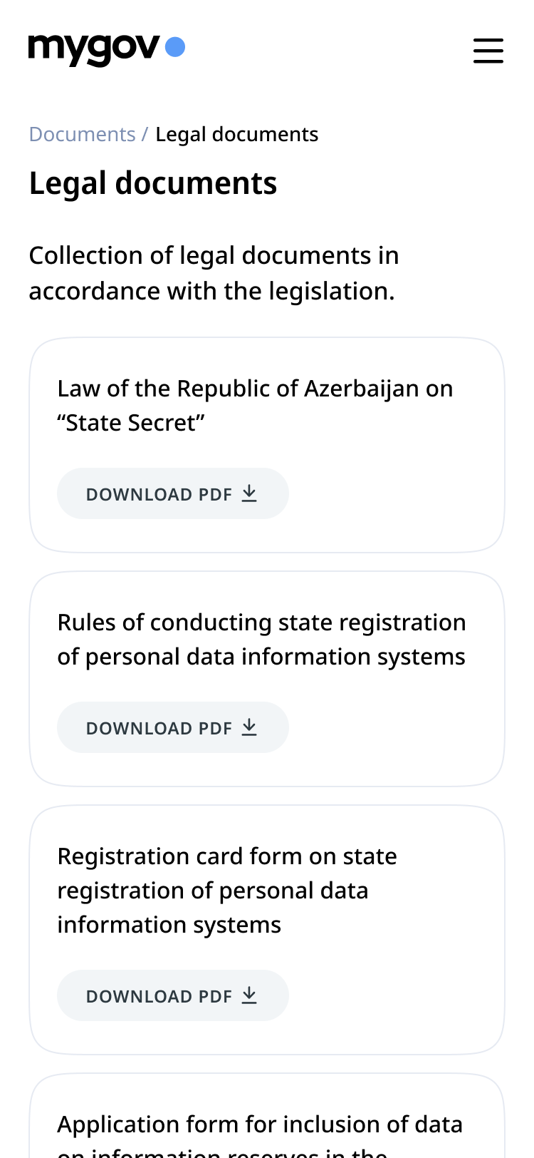
Mygovplatform
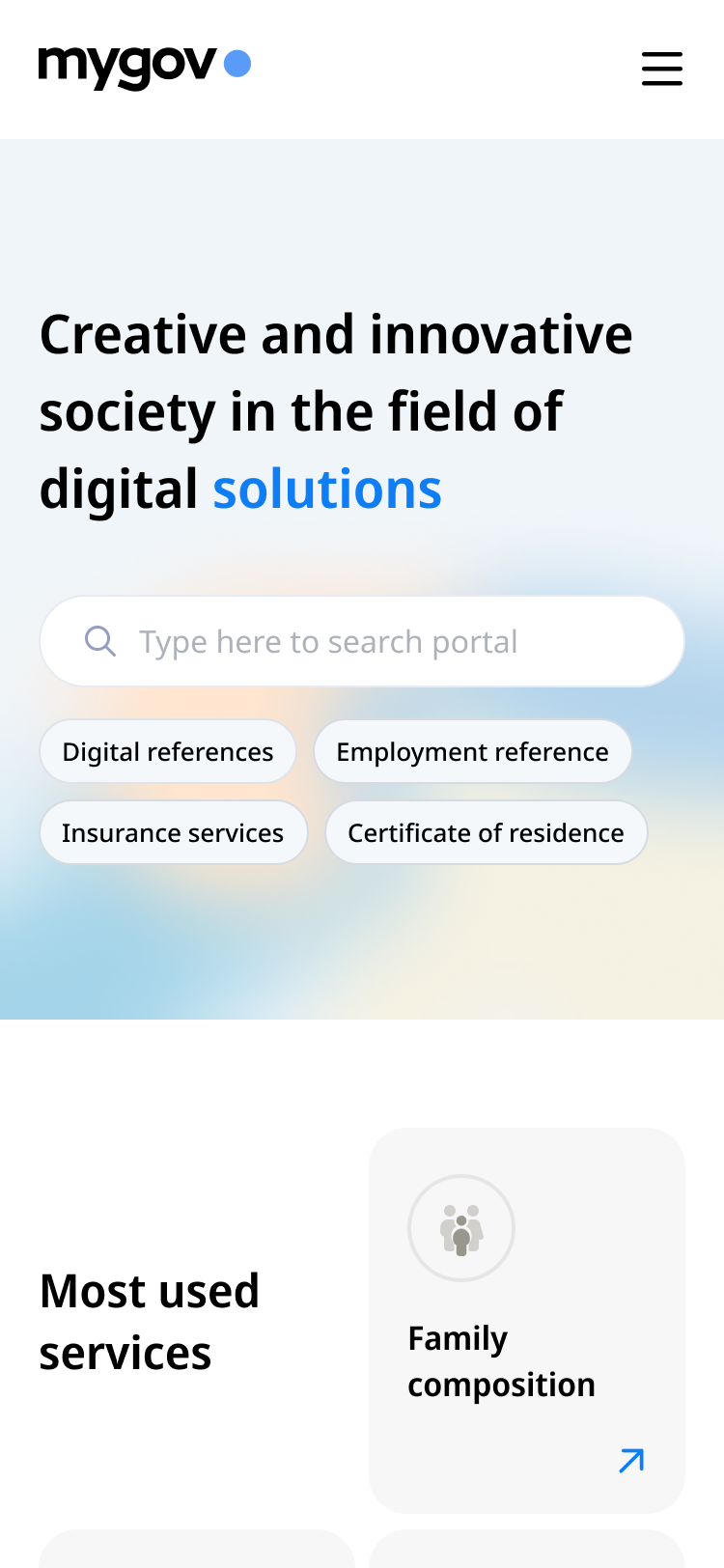
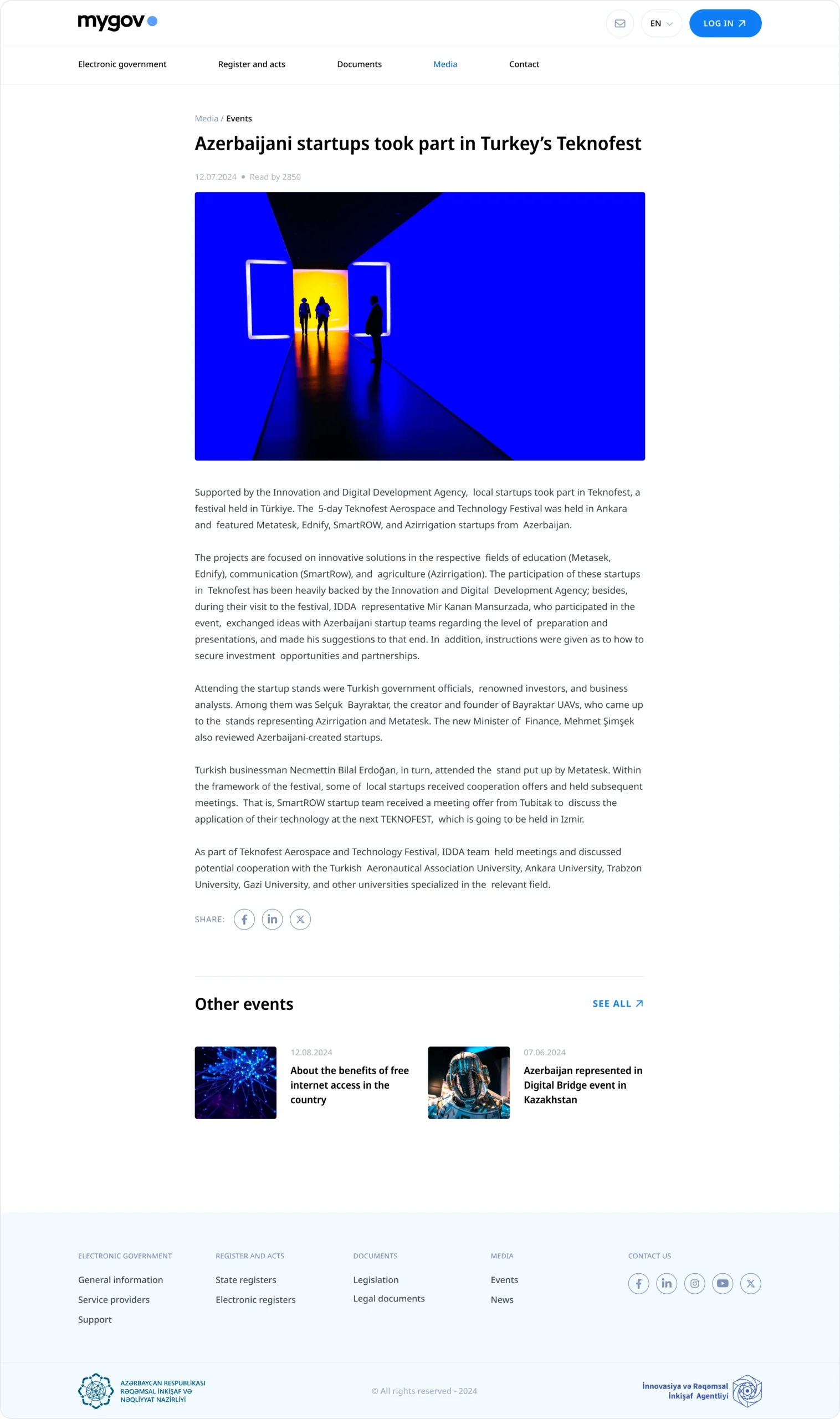

The goal of the MyGov website redesign was to establish a clear, accessible, and trustworthy digital presence for Azerbaijan’s national e-service ecosystem. Acting as the public gateway to the MyGov platform, the website needed to support millions of users in quickly understanding available services, navigating government processes, and accessing key resources. The design strategy emphasized transparency, simplicity, and accessibility—aligned with global public-sector best practices, including GDS guidelines and WCAG 2.1 compliance..
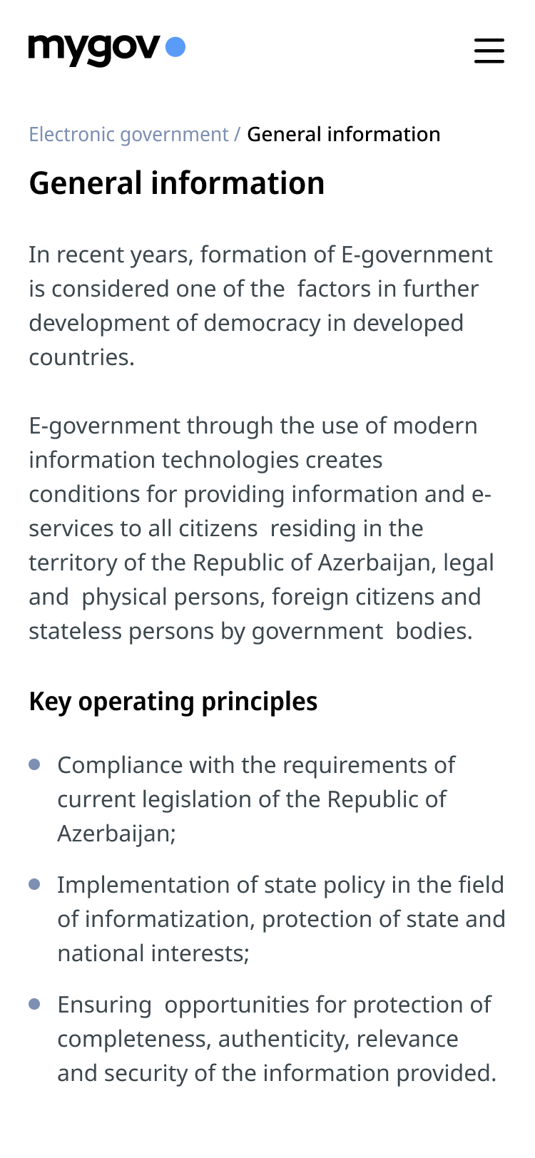
The legacy website suffered from vague structuring, inconsistent content labeling, and limited responsiveness—leading to low engagement and confusion among users, especially those with limited digital literacy. Information was often buried or fragmented, and lacked a clear content hierarchy. Since the website served a wide demographic—including elderly users, first-time visitors, and those on low-connectivity devices—clarity and performance needed to be prioritized alongside accessibility.
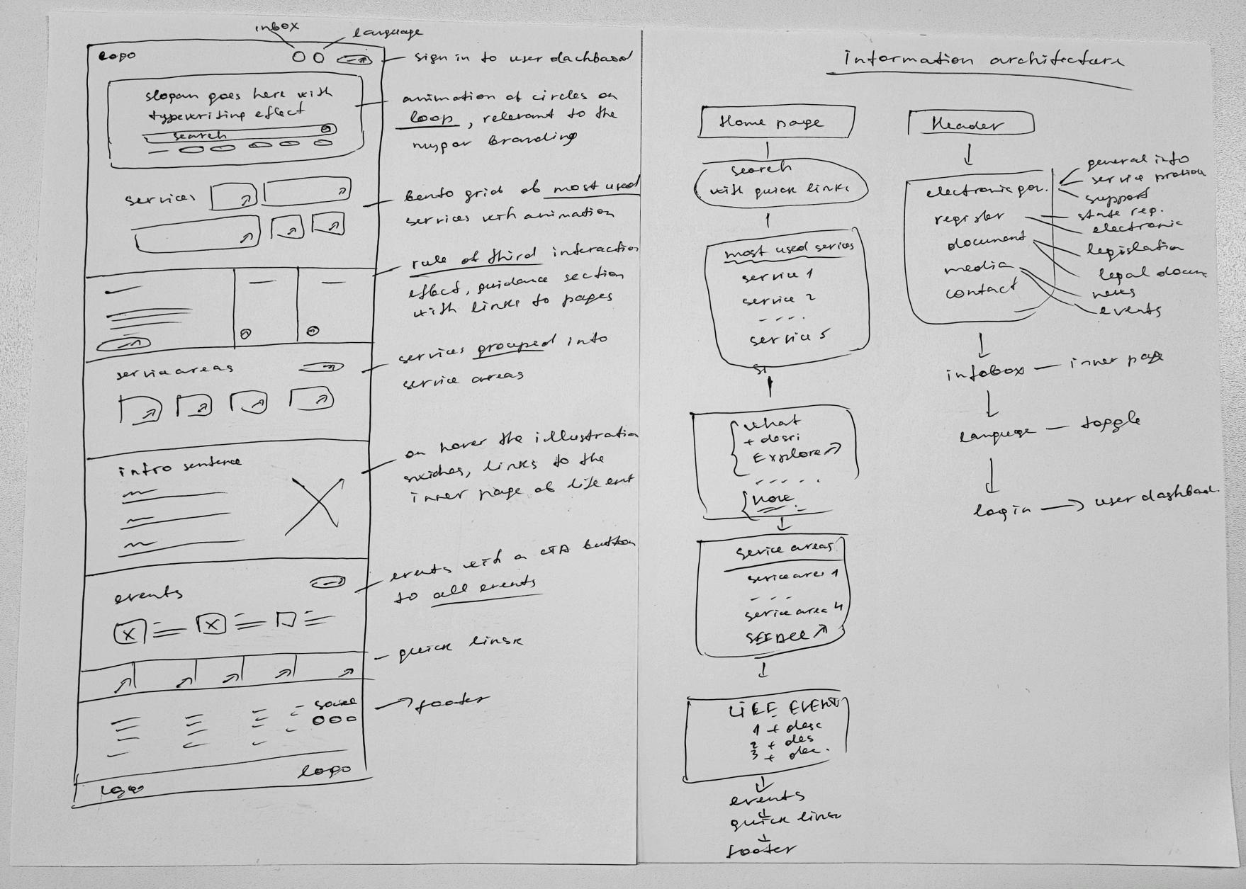
I applied a content-first UX strategy grounded in accessibility audits, user research, and analytics tools such as Hotjar and Google Analytics. I restructured the information architecture to follow a user-centered narrative—grouping high-priority information, FAQs, and onboarding resources into scannable, consistent sections. Key improvements included an improved typographic hierarchy, simplified language, icon-text pairings, and a mobile-first layout.
Post-launch metrics reflected the success of this approach: bounce rates dropped significantly, average session duration increased by 40%, and direct-to-dashboard traffic saw a measurable uplift—indicating improved orientation and trust. These improvements positioned the site as a reliable starting point for navigating Azerbaijan’s digital services.
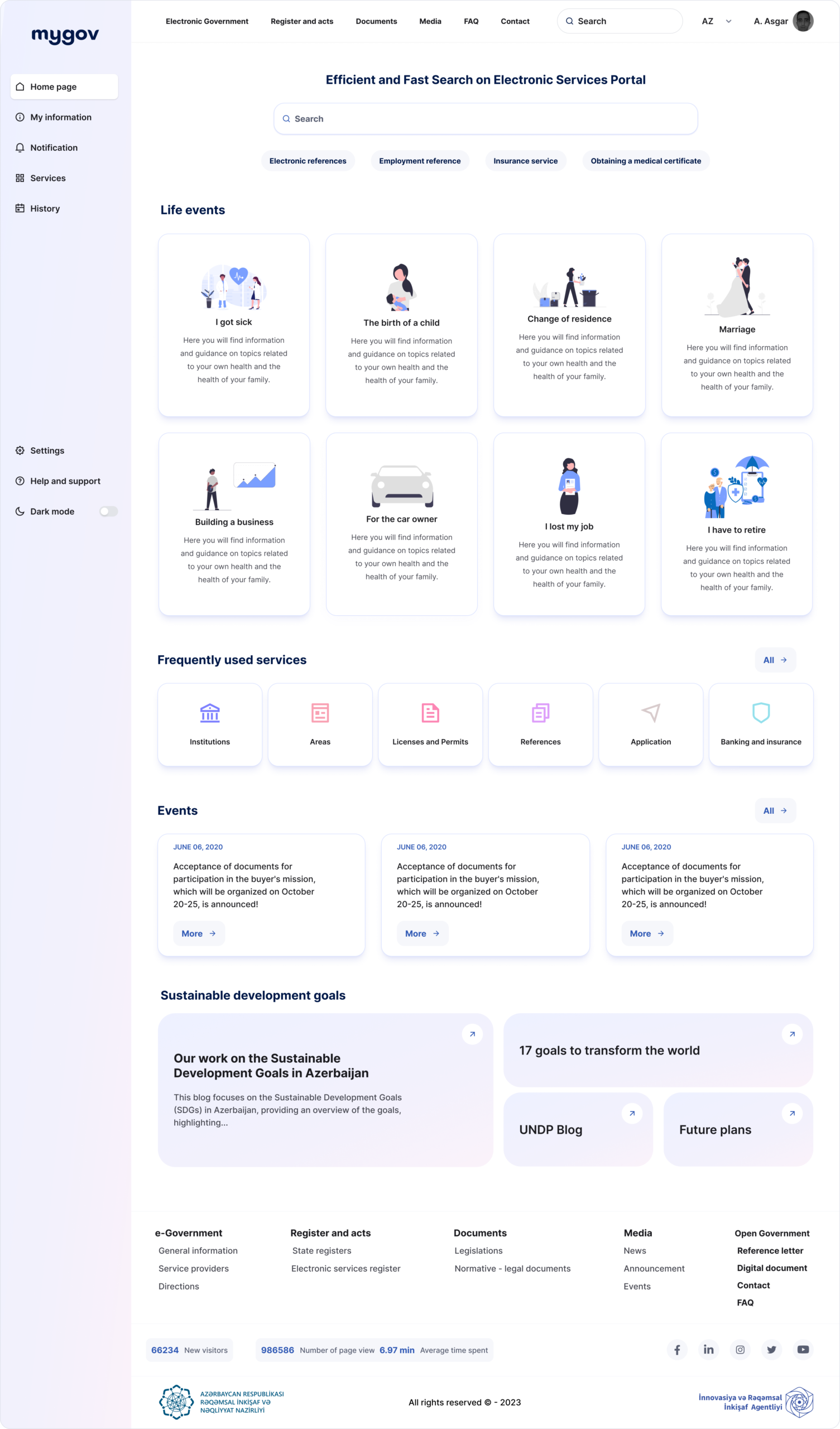
/ Old version: Didn’t provide users an idea about the the objective of the platform and its features.
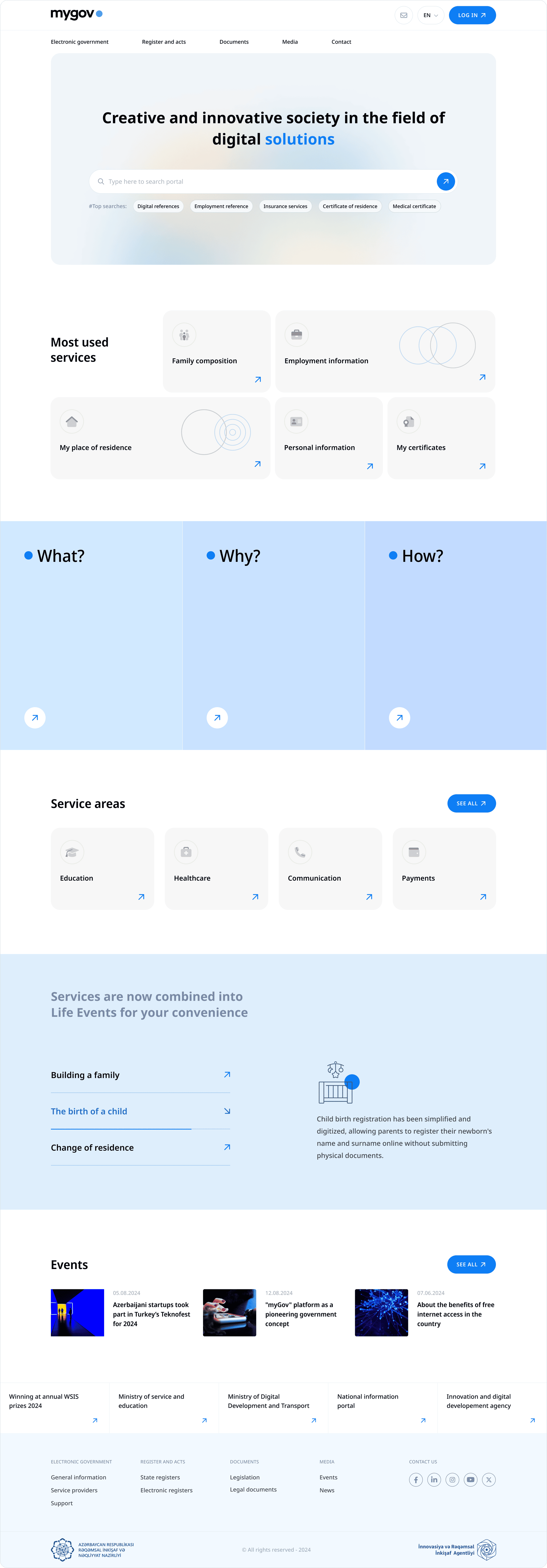
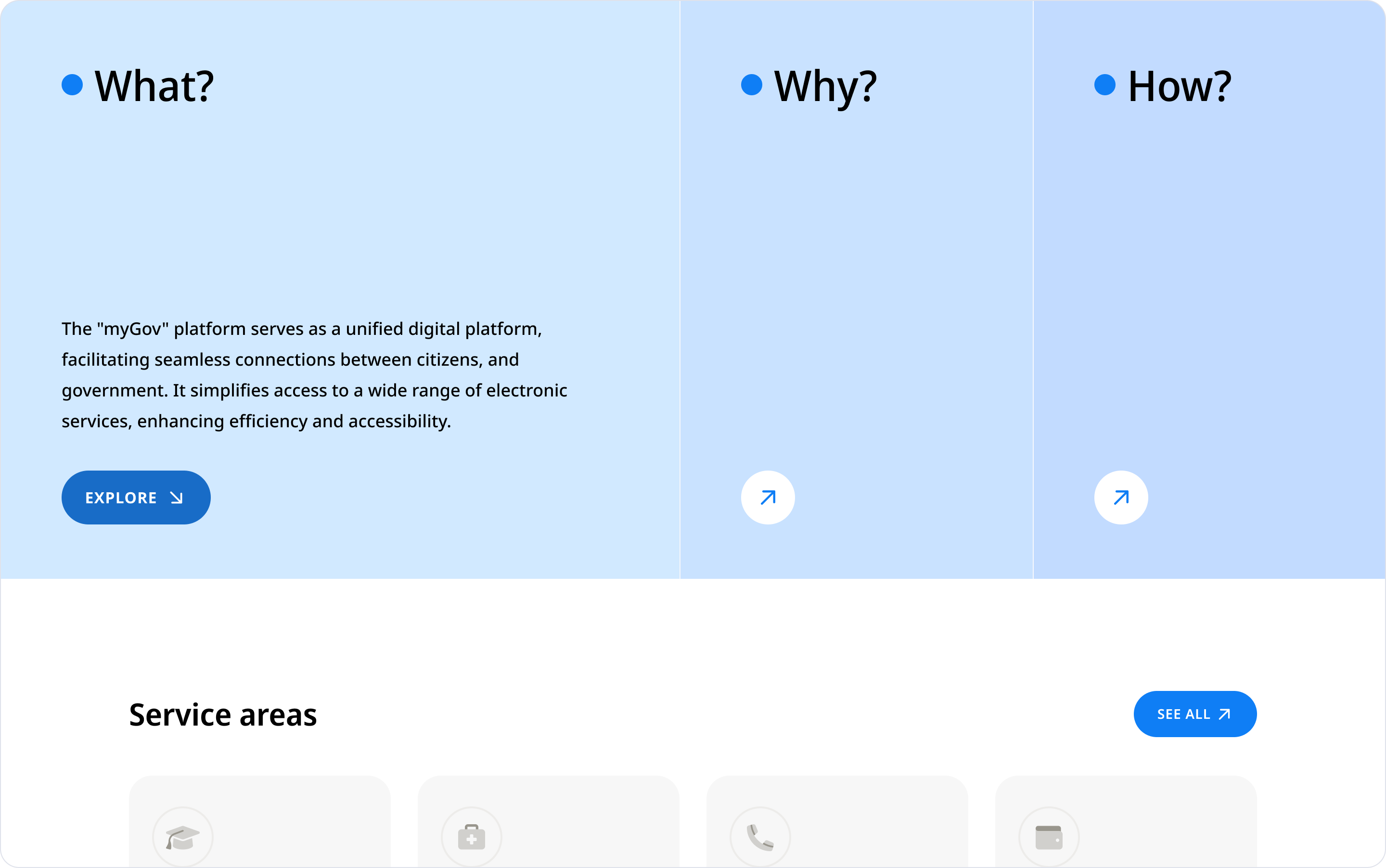
/ New version: The “What?”, “Why?”, and “How?” sections with animated interactions offer a simplified guide, improving overall user understanding and engagement.
/ Old version: Services were categorized under various headings, but the presentation was visually cluttered.
/ New version: Grouping services under “Life Events” simplifies access during significant personal milestones.
/ Old version: Had a traditional look, equal visual weight was given to all elements, diminishing focus.
/ New version: The application of consistent color schemes, larger fonts, and ample white space improves visual appeal and readability.